Important: Keynote lacks several features that enable accessible document authoring. Missing features include:
- No ability to add hierarchy structured elements such as Headings. As a result, some of the other features that might otherwise support accessibility, such as its extensive templates are not as effective.
- No accessibility checker
- No way to set manual reading order of a slide. The slide is read in geometric order. Generally, it’ll be read left to right, top to bottom. There is no way currently to manually order the way that VoiceOver reads items on a slide.
We recommend exporting any Keynotes created to PowerPoint to scan for accessibility and share your documents from there.
The following how-to pages will cover the limited steps you can do to make Keynote documents accessible.
Guidelines for creating accessible Keynote documents
As you develop your content in Keynote, use the accessibility guidelines below and learn how to make the elements accessible.
Create the Keynote Presentation
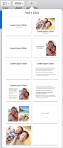
Use slide layouts that meet your specific needs. The following graphic shows the slide layouts that are built-in to Keynote.
Text
Use a text font that is easy to read.
- Avoid using serif fonts for presentations. While these are quite legible in print, sans serif fonts tend to be easier to read on a screen.
- Avoid small font size.
- If there is an image with text in it, make sure to put the text in the alternative text so it is accessible to users with screen readers when reviewing on their computers.
- Follow the steps below for creating headings in your content for structure.
Headings – Unfortunately there is not a way to set Heading levels in Keynote.
We do recommend, however, using paragraph styles for a cohesive hierarchy in your slides. Keynote Paragraph Styles Overview.
About Headings
Use properly formatted headings to structure the page. Making headings larger and bold is not enough to designate them as a heading. Instead Headings need to formatted as headings.
Heading Tips:
- Consider Heading 1 to be like a book title. Typically you only use one Heading 1 on a page. Heading 2s are like chapter titles and Heading 3s are sub-sections of those chapters, etc.
- Heading order is similar to an outline order
- Headings MUST be used in order. Don’t skip levels
- Do not use headings to achieve visual results only
- Headings help chunk material to make the content easier for everyone to read.
- Headings are an important part of navigating content for users with a screen reader.
- More information & tips for structure and lists in HTML can be found on WebAIM.
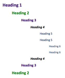
Example of possible order that headings might be used.
Images and Graphics (including Graphs, Maps & Shapes)
Provide alternative text descriptions (Alt Text) for images and shapes. Alternative text provides a textual alternative to non-text content in web pages. The text is read by screen readers in place of images allowing the content and function to be accessible to those with visual or certain cognitive disabilities. It is displayed in place of the images if the image file doesn’t load properly. Remember: Computers and screen readers do not analyze the image and determine what it is presenting. The text must be provided to the user with presents the content and function of the images.
Alt Text Tips:
- Be accurate and equivalent in presenting the same content and function of the image.
- Be succinct. Typically no more than a few words are necessary to describe content and function.
- NOT be redundant or provide the same information as text within the context of the image.
- NOT use phrases of “image of…” or “graphic of…” to describe the image.
- Context is everything. Place the images on the page in a logical place in relation to the content. The alt text might change depending on the location of the image.
- Decorative images need to marked as such.
How-to add alt text to images:
- In Keynote, select the image that you want to add alt text.
- On the right panel, select the Image tab.
- Type description text in the Description field.
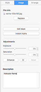
- Repeat for additional images.
Complex images
If your image is complex, such as a chart, graph or map which cannot be described concisely in a few words while presenting the content and function, then you will need to provide more information. So, ask yourself a question, is it possible to get all of the important information about your image by a brief phrase (typically what is used for alt text)? If the answer is no, you MUST provide a more detailed long description.
- Describe the image in surrounding text. If the image is adequately described in the text surrounding the image, including text-based tables, then add a short alt text label so it is clear what the image is and that the student can correlate the image with the description.
- Link out to a webpage with a longer description. The link can be adjacent to the image or the image itself can be linked to the long description page. The alt text for the image should still describe the general content of the image.
- Use a caption. To add a caption in Word, select the image, then right click and select Insert Caption. Type your caption then click OK.
Lists
Format Lists as lists. Formatting, such as lists, headings and links, are read by screen reader to users, so the content is understood in context.
Lists Tips:
- Ordered lists suggest a progression or sequence.
- As with heading, lists should be used correctly and for the right purposes.
- Unordered and ordered lists should always contain list items.
- Lists should never be used for merely indenting or other layout purposes.
- Avoid manually adding a special character (hyphens/asterisks) or typing numbers one-by-one instead of using lists.
How-to create Lists:
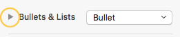
- In Keynote, select the text that you want to make into a list.
- On the right side of the screen in the Inspector panel, in the Text tab, select the dropdown menu for Bullets & Lists. Select what type of list you want from the list. (Select the Numbers – if a sequential order is important to the list or Bullets list – if all items are of equal value.
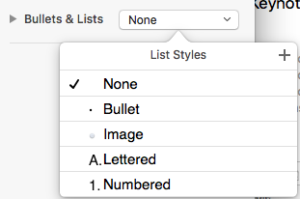
- If you wish to further stylize the list options, select the arrow next to “Bullets & Lists” to reveal further options such as indenting preferences, bullet type and size.
Links
Write meaningful link text that indicates the link’s destination. Links are important to navigation for all users, but especially screen reader users. Links are more useful when meaningful text is used.
Link tips:
- Don’t include “link” in the link text because all users already know it is a link.
- Links should make sense out of context. Avoid “click here,” “click for details,” “here,” “read more,” “more,” and “info” for example.
- Avoid overkill including every detail about a link destination.
- If possible, place your links in alphabetical order. This helps with organization and readability.
- Linking out to someone else’s website? Is it accessible? Make sure any pages you link out to are accessible, otherwise your students may have difficulty accessing the material. Check a site’s accessibility with the Wave Web Accessibility Tool.
- Important for Keynote & PowerPoint Documents: If you think students will be printing the document and you want them to have the URL, put it in parentheses after the link, but don’t hyperlink it.
- Example: Texas Christian University (www.tcu.edu)
How-to create links with meaningful text:
- In Keynote, type out the text that describes the destination of the link. Example: Texas Christian University.
- Select the text, right click and choose Format from the menu then Add Link.
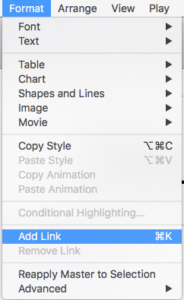
- In the Link To window, select Webpage from the dropdown menu.
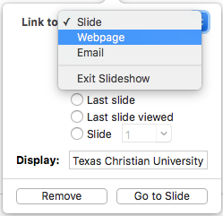
- Type the URL of the website in the Link to: field. For our example, we would type: “http://www.tcu.edu”

- Optional: Click Go to Page to test the link.
- Click anywhere in the slide to save the link.
Tables
Create data tables with column headers. Designating column headers in a table is essential to screen reader users understanding how the information is laid out.
Ensure Proper reading order in tables. Screen readers read tables from right to left, top to bottom, one cell at a time (no repeats) if cells are split or merged, the reading order can be off. To test reading order, place your cursor in the first cell of the table. Press the tab key repeatedly to navigate through the table. This will be the reading order that assistive technologies will use
Table Tips:
- Avoid using tables for structure/design
How-to create a table with headers:
Keynote makes it easy for you to setup tables with headers upon creation of the table.
- In Keynote, place your cursor on a slide you want to add a table.
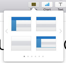
- Click the Table icon on the top of the Keynote software.

- From the pop up menu, scroll through the options and select your preferred table format. In the example below, the options with blue on the top or left column indicate a built-in header row or header column. These will automatically be formatted correct for header rows.
- Place your cursor in the table to add your content. Add/delete rows or columns as needed.
- To confirm the header settings, on the right side of the screen in the Inspector panel, review the Header & Footer options.
How-to create column headers in tables:
Follow the steps below if your table didn’t already have table headers.
- In Keynote, place your cursor in the top row of your data table.
- The Table options will display on the right side in the Inspector panel.
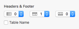
- Set the Header, Column or Footer settings as needed. In the example below, the 1 Header row is selected.
Color
Don’t use color alone to convey meaning. Color alone should not be used to make distinction, a comparison or to set something off or apart from the rest of the web page. If you categorize something by color alone, those who are color blind or blind will not benefit from the color distinction.
Use sufficient color contrast. If you print your color graphic on a black and white printer, would it be understandable? Without sufficient color contrast, people who are color blind will not be able to benefit from the information.
Slide’s Reading Order
The slide is read in geometric order. Generally, it’ll be read left to right, top to bottom. There is no way currently to manually order the way that VoiceOver reads items on a slide.
Maintain proper reading order in the slides. By default, the reading order of a slide is the order in which objects are added. If you use a blank layout or added text boxes manually to a slide, the reading order for your slide could be off for a student using a screen reader or tabbing through the slide. If the tab order is not the proper reading order, the slide will be confusing.
Check the reading order of a slide:
- Click on your slide either in the grey area surrounding the slide or on an area of the slide not containing a placeholder.
- Hit Tab on your keyboard. The first thing on the slide that a screen reader would read will be selected.
- Hit Tab again to see what the second thing read would be.
- Repeat for all slides.
Flashing/Blinking Content
Eliminate or limit blinking/flashing content to 3 seconds. Any flashing/blinking content (especially content in red) can cause seizures in people with photosensitive epilepsy as well as other photosensitive seizure disorders, so it should be limited and used only when necessary. Web pages that do contain flashing content, should limit the flashing to no more than three flashes per second and not use fully saturated reds in the content. If you do have content that flashes/blinks more than three times per second, freeze the blinking content momentarily so it falls below the three times per second limit. If you have a web video with a scene involving very bright lightning flashes (or other scenes with flashes), edit the video so the lightening doesn’t flash more than three times in any one second period.
Interactive Elements
Ensure that any action that uses a mouse can also be completed by a keyboard. Users with carpal tunnel and other mobility issues often cannot use a mouse. While there are more and more input device and software options such as speech to text software and touchpads, keyboard accessibility remains an important input format for many assistive technologies.
- Whatever the operation or behavior, make sure a mouse is not required.
- Try navigate the web page without a mouse.
- Use the following keyboard keys to navigate and interact with the web page all of its content: Tab, Arrow keys, Enter, and/or Spacebar. Keyboard commands clearly provided (and common operating system and browser keyboard commands) may also be used.
- Could you complete the course without using a mouse?
Label buttons. All buttons that require interaction with the user should be clearly labeled with real text or alternative text.
Video & Audio
Is media player keyboard and screen reader accessible? For accessibility purposes, it is better to link out to media rather than embed it in your PowerPoint. Layers of technology make it difficult for assistive technologies to navigate. If you do embed video or audio make sure the players are keyboard accessible. (YouTube and Kaltura players are accessible). Also keep track of media that isn’t captioned or transcribed since you will be asked for it when there is a captioning accommodation.
Math & Science
Math and science equations, formulas and notations can only be read by screen reading technology if you use PowerPoint 2013 (or later) with MathType 6.9 for Windows. Otherwise, be prepared to somehow extract all the content and place it in a file format that is accessible. Alternatively, you can utilize Pages to create mathematical equations.